


Milonic DHTML Menu Beginner User Manual
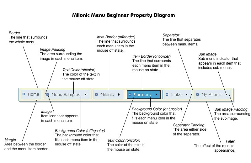
Terminology
Menu refers to a collection of text/images that make up a navigation tool.
Main menu is the first horizontal or vertical group of menu items that will appear on the page.
Menu items are the components that make up a menu. Each horizontal or vertical box is called an item and can contain text and/or images.
Sub menus are menus which are opened once pre-defined menu items are moved over or clicked using the mouse.
Property refers to each individual variable or attribute that makes the menu customisable. Examples are color, bgcolor, bordercolor, separatorcolor.
Style is the name of the pre-defined style that you intend to use for this menu. There are no restrictions to the quantity of styles you can use per menu.
Introduction
The Milonic DHTML Menu is made up of 4 Javascript files; mmenudom.js, mmenuns4.js, milonic_src.js and menu_data.js. This may sound complicated to novice or non-programmers so this manual aims to dispel any complexities encountered and run through the essential information providing examples along the way.
The manual is split into sections that mirror the order used in creating your
menu. You may find it useful to print out the manual before you begin so that
it may be used for reference or as a step by step guide.
Beginner
Manual Print Version
Download
Downloading the menu couldn’t be simpler, visit http://www.milonic.com/download.php
and you’ll see our website will offer 2 download links, one in .zip format
and the other in .tar.gz format. If you have already purchased a license the
system will create the download with the license details built-in to the code.
Click to download the preferred format and save in a suitable location.
The downloaded folder should contain 11 files; 4 javascript files(.js), 4 text
files(.txt), 2 html files and an image(.gif). The text files contain installation
instructions and our Software License Agreement, we advise that you read this
and only continue if you accept its terms and conditions.
Installation
Installing the menu can create some problems however if you follow these instructions
it should go without a hiccup.
- Copy the files mmenudom.js, mmenuns4.js, milonic_src.js and menu_data.js
to your web server. You can put these in a directory if you like but you will
need to add details of your directory to the code in section 2 below.
- Inform your web pages that you want the menu to appear when they are loaded.
To do this, you need to add the following JavaScript tags to your HTML page:
<SCRIPT language=JavaScript src="milonic_src.js" type=text/javascript></SCRIPT>
<script language=JavaScript>
if(ns4)_d.write("<scr"+"ipt language=JavaScript src=mmenuns4.js><\/scr"+"ipt>");
else _d.write("<scr"+"ipt language=JavaScript src=mmenudom.js><\/scr"+"ipt>"); </script>
<SCRIPT language=JavaScript src="menu_data.js" type=text/javascript></SCRIPT>
The position of the above is not particularly important, but it's advisable to place these tags just after the <BODY> tag or in the <HEAD> of your document. This helps minimize the risk of a conflict with other objects. The order in which the tags appear IS important, and must be as shown above. It’s best to copy and paste to eliminate any mistakes.
- Load up your page with your web browser. If all is well, the menu should appear. If not, go over steps 1 and 2 again and ensure that all actions have been taken before you contact us.
Editing Your Menus
All menus are built using the default menu_data.js file that accompanies the
download. This is the only file you will need to edit in order to build and
design your menu for your own website or Intranet, etc. For this we recommend
a good quality plain text editor.
The menu_data.js File
Before we get down to the nitty gritty, let’s get acquainted with the
file we will be working with. Open up the menu_data.js file and have a look
at the javascript. At the top of the file there are 4 lines of code:
_menuCloseDelay=500
// The time
delay for menus to remain visible on mouse out
_menuOpenDelay=150
// The time delay before
menus open on mouse over
_subOffsetTop=10
// Sub menu top offset
_subOffsetLeft=-10
// Sub menu left offset
The first two lines control the time delay for menu opening on mouse over and
closing on mouse out. You will notice the default close delay is far longer,
this allows for navigating between parent and child menus without the menu closing
abruptly once your mouse moves off the parent menu.
The bottom two lines are used to apply an offset to a sub menu. An offset is
used if you do not wish to have submenus open directly underneath or adjacent
to the item that has opened it up.
Next in the code is where the style of the menu is declared:
with(menuStyle=new
mm_style()){
onbgcolor="#4F8EB6";
oncolor="#ffffff";
offbgcolor="#DCE9F0";
offcolor="#515151";
bordercolor="#296488";
borderstyle="solid";
borderwidth=1;
separatorcolor="#2D729D";
separatorsize="1";
padding=5;
fontsize="75%";
fontstyle="normal";
fontfamily="Verdana,
Tahoma, Arial";
pagecolor="black";
pagebgcolor="#82B6D7";
headercolor="#000000";
headerbgcolor="#ffffff";
subimage="arrow.gif";
subimagepadding="2";
overfilter="Fade(duration=0.2);Alpha(opacity=90);Shadow(color='#777777',
Direction=135, Strength=5)";
outfilter="randomdissolve(duration=0.3)";
}
The style contains all the color and size information for text, images, background,
borders, separators, padding etc. Each line has a different parameter and a
value. This is also where filters can be set, the last two lines indicate the
opening and closing filters for the menu. Above is one style, multiple styles
are used to vary colors between main and sub menus or menu items.
The rest of the file is made up of the main and sub menus data that forms the
complete menu. The code is split into blocks like this:
with(milonic=new
menuname("Main Menu")){
style=menuStyle;
top=10;
left=10;
alwaysvisible=1;
orientation="horizontal";
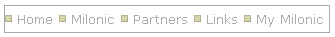
aI("text=Home;url=http://www.milonic.com/;status=Back
To Home Page;");
aI("text=Menu Samples;showmenu=Samples;");
aI("text=Milonic;showmenu=Milonic;");
aI("text=Partners;showmenu=Partners;");
aI("text=Links;showmenu=Links;");
aI("text=My Milonic;showmenu=MyMilonic;");
}
This code represents the main menu, and contains all the information needed
for its creation. The style, position and orientation are all defined
at the top of the menu. Each line beginning with aI that you see represents
a menu item. Text= denotes the text that will appear in the item. Url= sets
the destination address for clickable menu items. Status= allows you to add
status bar text when you mouse over the item. Showmenu= declares the name of
the menu you wish to open when the item is in the mouse over state.
Entering Text Into Menu Items
Open up the menu_data.js file if it isn’t already open and scroll down
to where you see the main menu block of code (above). The text that appears
in each menu item is declared in each aI string where you see “text=Home;
To change the text simply delete the text “Home” between the equals=
and semicolon; and replace it with whatever you wish to appear in the first
menu item of the menu.
Save the file and load up your page with your web browser to see the change.
Adding/Deleting Menu Items
Each line starting aI in each menu block represents a menu item;
aI("text=Menu Samples;showmenu=Samples;");
so if you wish to add further items simply copy and paste an existing line of
code. This can then be edited to contain the information you need. Deleting
a menu item is just as simple, highlight the line that is surplus to requirement
and delete!
Adding/Deleting Menus
To add another menu copy and paste an existing menu, change its name and then
change the menu items to suit your needs.
Remember each menu will look something like this:
with(milonic=new menuname("Anti
Spam")){
style=menuStyle;
aI("text=Spam Cop;url=http://www.spamcop.net/;");
aI("text=Mime Defang;url=http://www.mimedefang.org/;");
aI("text=Spam Assassin;url=http://www.spamassassin.org/;");
}
In order to open the new menu, you'll need to add a menu item with a showmenu
declaration pointing to the name of your new menu. The menu example above is
opened from the anti spam menu item in the Links menu:
aI("text=Anti Spam Tools;showmenu=Anti
Spam;status=Anti Spam Solutions, as used by Milonic;");
Styling Your Menu
Changing The Text Color
In the menu style section there are properties called oncolor and offcolor.
These control the text color in the mouse on and off states. The default colors
are as follows:
oncolor="#FFFFFF";
offcolor="#515151";
This means the text will change from grey to white when you mouse over it. Now
replace the hex values with those below, save the file and load up your page
with your web browser to see the change.
oncolor="#000000";
offcolor="#FE0101";
Any hex values can be added here, we suggest a strong color contrast to easily
distinguish between the mouse on and mouse off states.
Make The Most of Your Fonts
The font used in your menu is often overlooked and can add distinction to the
style of your menu. fontstyle='italic'; is used
to make your text appear in italics and fontweight='bold';
is used to make your text appear bold.
Other properties such as onbold, onitalic and ondecoration add interest in the
mouseover state.
onbold=1;
onitalic=1;
Declaring onbold and onitalic (above) will make your menu item text bolder and
italic when the mouse is moved over them. The ondecoration property sets the
text decoration for all menu text in the mouseover state. Options are none,
underline, overline or line-through, enter the line below into the style section
of menu_data.js to see the result.
ondecoration='underline';
Changing The Background Color
As with the text color properties, in the menu style section there are properties
called bgcolor and offbgcolor. These control the background color in the mouse
on and off states. The menu demo colors are as follows:
onbgcolor="#4F8EB6";
offbgcolor="#DCE9F0";
This means each menu item background will change from light blue to dark blue
when you mouse over it. Try the colors below for a stark contrast:
onbgcolor="#FFFFFF";
offbgcolor="#000000";
Remember to save the file and load up your page with your web browser to see
the change. If you would prefer not to have a background at all simply delete
these two lines of code.
Borders
The properties involved with the menu border are:
bordercolor="#296488";
borderstyle="solid";
borderwidth=1;
The border can make a huge difference to the appearance of your menu. The color
of the border can be changed the same as the text color and background color.
Borderwidth declares the thickness of the border and the borderstyle is the
way in which the color appears. Solid will show a continuous solid border, other
options are; dashed, dotted, double, groove, ridge, inset and outset. Apply
changes such as these:
bordercolor="#515151";
borderstyle="dashed";
borderwidth=2;
See how dramatically different the menu looks, test the other borderstyles to
see whether they will suit the design you have in mind. If you would prefer
not to have a border at all simply delete these three properties and values
from your menu_data.js file.
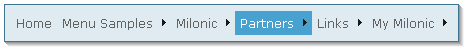
The diagram above highlights how the on and offborder properties operate. Item
borders work in the same way as the menu border, however instead of using many
different properties to obtain your design you can use just one for the offborder
and one for the onborder:
offborder="1px solid #aaaaaa";
onborder="2px solid #000000";
See how the size, style and color are combined into one single property. Try
adding item borders to your menu style and see the difference it makes. Onborders
and offborders are generally used with a margin (see below) to allow extra space
around the item.
Margins
Margins are useful to add space around the outside of your menu items but within
your menu border:
To add a margin you’ll need to add the following property to each menu that you wish it to appear;
margin=6;
So if you want a margin in your main menu the block of code looks like this:
with(milonic=new
menuname("Main
Menu")){
style=menuStyle;
top=10;
itemwidth=100;
alwaysvisible=1;
orientation="horizontal";
margin=6;
aI("text=Home;align=center;url=http://www.milonic.com/;image=red.gif;");
aI("text=Milonic;align=center;showmenu=Milonic;image=orange.gif;");
aI("text=Partners;align=center;showmenu=Partners;image=yellow.gif;");
aI("text=Links;align=center;showmenu=Links;image=green.gif;");
aI("text=My
Milonic;align=center;showmenu=MyMilonic;image=blue.gif;");
aI("text=Search;align=center;image=purple.gif;");
}
Try adding the margin property to your menu with varying sizes and view how different the menu looks with this "breathing space".
Separators
A separator adds definition between each of your menu items. In the demo you
have downloaded, the separator appears as a basic line which adjoins the border:
separatorcolor="#2D729D";
separatorsize="1";
There are many other properties which can add flexibility to your separators;
 |
separatorwidth=’60’; declares the width of your separator (this value must be smaller than the width of the menu to be visible). | |
 |
separatoralign=’left’; declares the alignment of your separator (you must have declared a separatorwidth that is smaller than the width of the menu to be visible). | |
 |
separatorpadding=’2’; will add white space either side of the menu item separator in both horizontal and vertical menus. |
|
 |
separatorimage=’yourimage.gif’; allows a custom image to be used instead of a standard separator line. Here we’ve used a simple gradient (you must have declared a separatorsize that is large enough to contaiual/separatorimage.gif" width="129" height="85"> | separatorimage=’yourimage.gif’; allows a custom image to be used instead of a standard separator line. Here we’ve used a simple gradient (you must have declared a separatorsize that is large enough to contain your image). |
Separators can also be removed easily by deleting the separator properties.
Using Images
Images can be used to great effect and there are many ways images can be added
to your menu design. Declaring images in your style will make the images appear
in all menus that use the style. For more specific use of images they can be
added to each individual menu item (see page 7).
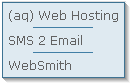
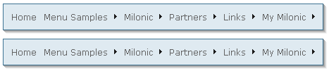
Subimage
In the demo we are using, the only images that appear are subimages, these are
the indicators that show there is a submenu available.
Above you can see that all the items except “Home” have submenus.
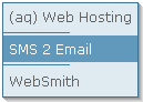
The position of subimages can be adjusted through the use of subimagepadding.
The default setting for subimagepadding in this example is 2. The property looks
like this:
subimagepadding="2"; and can be found
in the style section of the code. Try changing the value to 10, save the file
and view in your browser.
See how space has been added around the subimage and not around the whole item.
Changing the color, size or position of the arrow in a separate image and having
them swap between the mouse on or off state is a great way of highlighting your
selected menu item. The property that allows this second rollover image to be
activated in the mouse on state is onsubimage. Add the line of code below to
your style (substituting arrow_on.gif with the name of your file), save and
test to see how effective it can be.
onsubimage="arrow_on.gif";
Image
The image property enables you to add an image which will be placed to the left
of the text, so when it’s used in the style it’s ideal to insert
small bullet type images that punctuate each item.
To add an image copy the image to your web server or menu directory and insert
this line to your style:
image="yourimagename.gif";
Save the file and test in your browser, you should see that every item that
uses the style now has your image. You will notice that your image is placed
to the left of the menu item leaving no space between it and the border. This
may be a design feature you wish to keep or you may wish to add padding as we
did with the subimage.
The property responsible for this type of padding is imagepadding and is declared
by using the following line of code:
imagepadding="6";
See how the padding has been added around the image and not affected the height
of the menu item. The image and imagepadding properties can be added to your
style anywhere, here’s an example:
subimage="arrow.gif";
subimagepadding="2";
image="square.gif";
imagepadding="6";
overfilter="Fade(duration=0.2);Alpha(opacity=90);Shadow(color='#777777',
Direction=135, Strength=5)";
outfilter="randomdissolve(duration=0.3)";
}
To add a rollover or change of image in the mouse on state, simply add another
property called overimage to your style section. Here’s how it should
appear:
overimage=”yourimage_on.gif”;
As you can see above you can create subtle but effective definition between
images as they are rolled over.
Using Image in Menu Items
Using the image property in a menu item rather than the style allows greater
flexibility as each item can hold a different image.
We will use the coloured square example above to show how this can be achieved.
Note: we are not using subimages in this example for clarity reasons only.
To test this for yourself you will first need a number of different images, if you haven’t got any suitable images to hand visit the image forum or http://www.milonic.com/forum/viewtopic.php?t=4602 and save some of the available coloured squares (right click, then Save Picture As…).
The menu code you are working with will have the following menu item declared
in the main menu block of code:
aI("text=Home;url=http://www.milonic.com/;status=Back
To Home Page;");
This represents the “Home” menu item, as we do not need the status
text for this example remove the text status=Back To Home Page; so you are left
with this:
aI("text=Home;url=http://www.milonic.com/;");
Now we can add our image. First make sure all your images have been copied to
your web server or menu directory. Then add image=red.gif; (substitute red.gif
for the name of your file) to the end of the aI string (inside the brackets
between the semi colon and second quote) so it appears like this:
aI("text=Home;url=http://www.milonic.com/;image=red.gif;");
Your image should now appear alongside the “Home” text in the first
menu item.
To review your image, save menu_data.js and view the menu in your web browser.
Add your further images in the same way, remembering to save and view the changes
each time you add an image. You may wish to add imagepadding if you are unhappy
with the spacing between the image and border, this is achieved in the same
way we did previously.
You may notice the text in your menu item no longer appears balanced, adding
the align property align=center; to your menu item will make it more central:
aI("text=Home;align=center;url=http://www.milonic.com/;image=red.gif;");
Once you’ve added your images the main menu code should look something
like this:
with(milonic=new
menuname("Main
Menu")){
style=menuStyle;
top=10;
left=10;
itemwidth=100;
alwaysvisible=1;
orientation="horizontal";
aI("text=Home;align=center;url=http://www.milonic.com/;image=red.gif;");
aI("text=Milonic;align=center;showmenu=Milonic;image=orange.gif;");
aI("text=Partners;align=center;showmenu=Partners;image=yellow.gif;");
aI("text=Links;align=center;showmenu=Links;image=green.gif;");
aI("text=My
Milonic;align=center;showmenu=MyMilonic;image=blue.gif;");
aI("text=Search;align=center;image=purple.gif;");
}
Creating images that rollover or change in the mouse on state is straightforward,
simply add another property overimage=white.gif;
to your menu item aI string so it appears like this:
aI("text=Home;align=center;url=http://www.milonic.com/;image=red.gif;overimage=white.gif;");
All Image Menus
For those who intend to use only images and no text you can use the same method
applied to using the image property in menu items. The main difference will
be your style, very little style information is needed if you opt for an all
images menu.
Once you’ve created your images simply declare them in each menu item to build your menu and style. Using only images in your menu design, gives you full control over the shape and feel of the navigation tool. It means that designers can be creative and do not have to adhere to the standard box type menu pattern.
Visit out all images
sample for futher details.
Background Images
The background images in the menu are controlled by the bgimage property and
allow you to add images that will sit behind the text.
The bgimage property can be declared in both the menu style and menu item in
the same way the image property is used. For identical background images in
each item (see above) declare the property in your menu’s style:
imagepadding="10";
overfilter="Fade(duration=0.2);Alpha(opacity=90);Shadow(color='#777777',
Direction=135, Strength=5)";
outfilter="randomdissolve(duration=0.3)";
bgimage="background.gif";
}
You can use a custom sized image to fit the exact menu item shape or you can
use a small image which will be repeated to fill each item’s space. To
place a different background image in each menu item declare the property in
the menu item aI string so it appears like this:
with(milonic=new
menuname("Main
Menu")){
style=menuStyle;
itemheight=31;
itemwidth=100;
alwaysvisible=1;
orientation="horizontal";
aI("text=Home;align=center;url=http://www.milonic.com/;bgimage=disco_left.gif;");
aI("text=Milonic;align=center;showmenu=Milonic;bgimage=disco_mid.gif;");
aI("text=Partners;align=center;showmenu=Partners;bgimage=disco_mid.gif;");
aI("text=Links;align=center;showmenu=Links;bgimage=disco_mid.gif;");
aI("text=My
Milonic;align=center;showmenu=MyMilonic;bgimage=disco_mid.gif;");
aI("text=Search;align=center;bgimage=disco_right.gif;");
}
The code above informs the menu to use the three images in specific menu items,
disco_left.gif in the “home” item. The disco_mid.gid image in “Milonic”
“Partners” and “Links,” and disco_right.gif in the “Search”
item:
This property is great for adding intricate designs to your menu style without having to incorporate text into the images for both the on and off state.
Background images can also be used to achieve rollover effects as the mouse moves on and off each menu item. To do this you’ll need the overbgimage property. As with bgimage, overbgimage can be declared in both the menu’s style (to appear in all items using that style) and each specific menu item.
To test the bgimage and overbgimage effect at work you’ll need two different images (preferably the same size). The best results are often achieved by using similar images with subtle differences.
Menu Background Images
The menubgimage property is used to add an image to the background of the whole
menu rather than each menu item. This means it is ideal for adding texture to
a menu as the image can be repeated without having seems or joins in between
each menu item. It’s also useful for users who wish to use margins (the
area between the item and border) as it fills the entire space inside the border
not just the menu item area.
Adding more than one menu to a page
Many of our users use both a horizontal and a vertical menu on their websites
to help navigate their vast number of pages and add interest.
The first thing you’ll need to do is create a data file for your second menu. To do this make a copy of your original menu_data.js and rename it menu_data_new.js
Then in menu.htm (or your web page that contains the menu) add an additional call to your new menu_data_new.js file so the source code now looks like this:
<SCRIPT language=JavaScript src="milonic_src.js"
type=text/javascript></SCRIPT>
<script language=JavaScript>
if(ns4)_d.write("<scr"+"ipt language=JavaScript src=mmenuns4.js><\/scr"+"ipt>");
else _d.write("<scr"+"ipt language=JavaScript src=mmenudom.js><\/scr"+"ipt>");
</script>
<SCRIPT language=JavaScript src="menu_data.js"
type=text/javascript></SCRIPT>
<SCRIPT language=JavaScript src="menu_data_new.js"
type=text/javascript></SCRIPT>
Now to reposition your second menu. This is necessary because both menus are
placed at exactly the same point on the page so it will appear that only one
is present. Open up your menu_data_new.js file and scroll down to the main menu
section of the code. You should see a top value and a left value like this:
top=10;
left=10;
Change these values to reflect where you want the second menu to appear, for
example if you want it to sit underneath the original menu try these values:
top=60;
left=10;
Test your page in your web browser to see how the two menus work together on the page.
As you can see, at the moment the menus are identical but that’s only
because the second menu’s data file is a copy of the original.
If you want your second menu to be vertical you’ll need to change the
menu’s orientation. To do this simply change orientation="horizontal";
to orientation="vertical"; in the main menu block of code. Now all
that’s left to do is to insert any differing text/link information and
style the new menu.
Inserting An Email Link
Most websites have to include a contact link on all pages, so why not place your email link actually in the menu. This will free up some valuable space and make your contact address more accessible.
Inserting an email link into the menu works in the same way as any link, only
where you would normally place url=http://..... you place the following:
url=mailto:info@example.com;


Learn about how Milonic's DHTML menus can benefit your site
What does it cost? DHTML Menu prices
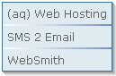
Who is using us?
Sample Client list
Bespoke menu design and build service from the Milonic team
Our bolt-on modules provide free optional extras for specialist projects
Free icons and images for all licensed users with our Menu Imagepack
What is Milonic up to at the moment? Check our blog